All CSS units compared & explained!
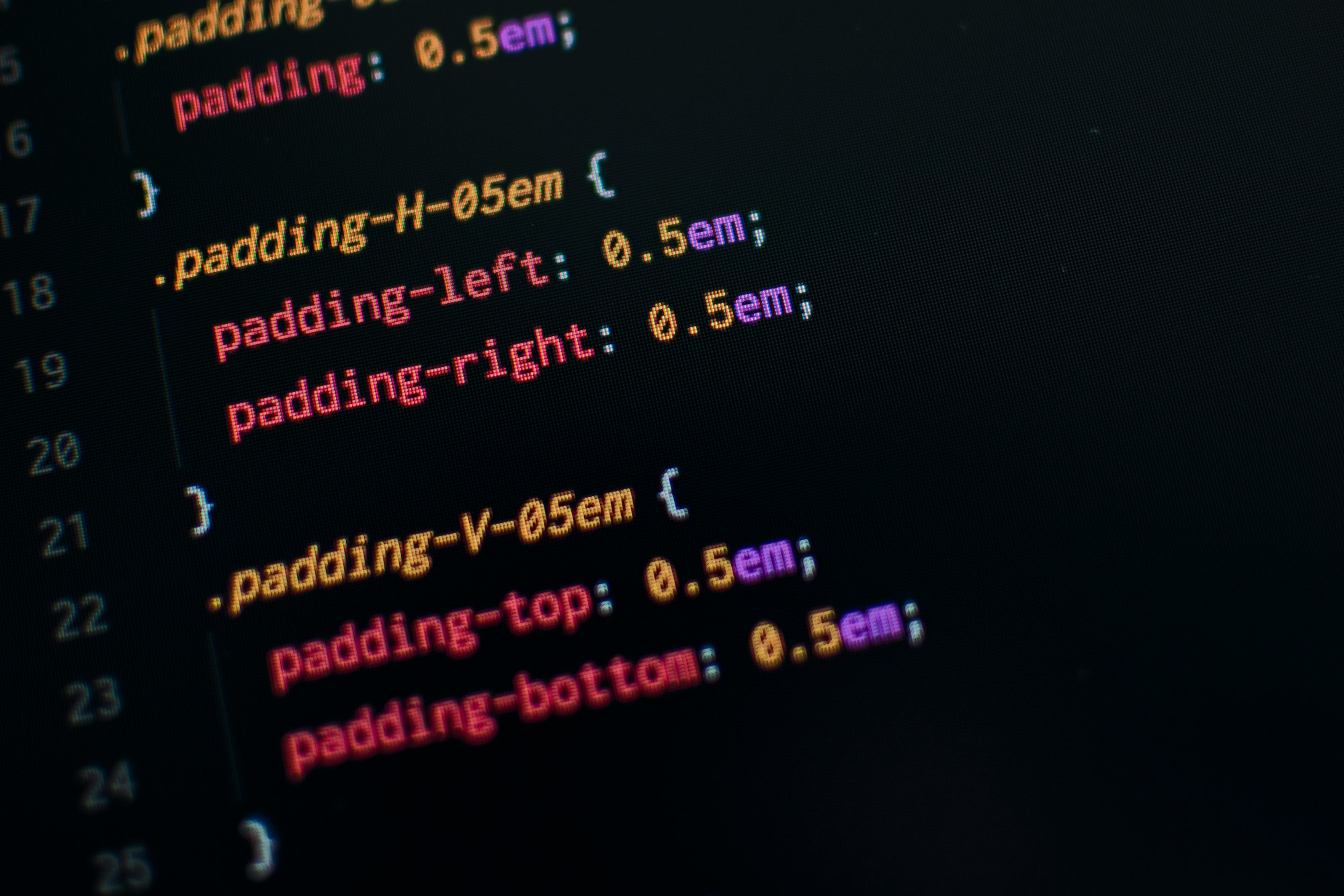
.unit-showcase { all: unset; align-items: center; align-self: flex-start; border: 1px gray solid; border-radius: 2rem; display: flex; justify-content: left; margin-bottom: 0.5rem; padding: 0.5rem; } .unit-display { background: linear-gradient(45deg,#e65100,#ff9d00); height: 4px; } .unit-description { font-weight: bold; margin-left: 1rem; }
Cascading Style Sheets or CSS as it’s usually referred to as forms the backbone of the modern web. Like HTML is responsible for structure, and JavaScript for interactive features, CSS handles all the styling, making your website look as gorgeous as it does.
Now, even though CSS is not a programming language (deal with it), there’s still a learning curve associated with it. Especially in recent years, I’d argue that CSS features have grown to such an extent that it’s no longer sustainable to use it without some “googling”, autocompletion, or another source of reference.
Among those growing features of CSS is its unit system. Long gone are times of “pixel-perfect” designs utilizing px unit, and in are the relative ones, allowing developers to create responsive designs for the plethora of form factors of modern devices.
So today, I’d like to stick to the basics a little bit and guide you through all the CSS units, explain what they mean, how they work, as well as their cross-browser support and some of my personal reflections on them. Hope you find it useful. Let’s dive in!
Absolute
We’re starting with the “dumbest”, absolute units. Here, we’ve got all the units that should be used for only specific parts of the website design, or when customizing it for printing.
px
The most commonly used of the bunch. While `px is commonly associated with a pixel, due to the abbreviation, it’s not necessarily equal to one pixel on the screen. Does that mean that `pxs aren’t really absolute? Well, kind of yes, but also no.
It’s a unit specifically-design for CSS, and its real value varies, depending on the screen or printer “density”, aka PPI (Pixels Per Inch), or DPI (Dots Per Inch) respectively. In this regard, it’s somewhat relative. Use screens of different resolution and similar sizes to find out for yourself - you’ll see that no matter the resolution, px should look the same.
100px
Still, px is not the best unit for creating responsive designs. It’s relative to PPI/DPI but that only guarantees that it’ll look the same throughout different screen resolution. It’s not relative to any particular value that can be set by the developer. It’ll certainly be useful for setting e.g. root font-size or min/max dimensions of an element, but you shouldn’t overuse it.
cm / mm / in
Here I’ve bundled 4 units, as they share some common properties. All of them are usually used in real-world measurements. Because of that they’re mostly fit for styling your website for printing (under the @media print {} rule), rather than directly for the screen.
While using these units for printing should result in relatively correct real-world representation, the same doesn’t apply for using them on screens. So if you put a ruler to your screen (don’t do that) don’t expect the element with 1cm width to be real 1cm.
There’s an option to do some math to display a “real” cm on the screen though:
1in = 2.54cm = 25.4mm = 101.6q = 96px
Note: I also threw
q(quarter-millimeters) in the mix which equals 1/4th of mm - a very unpopular unit, which usage isn’t recommended - for screens, printers, or otherwise.
And here’s some evidence to support these calculations:
96px
101.6q
25.4mm
2.54cm
1in
Keep in mind that while such measurements are possible, it’s not recommended to use them (unless you’re making a virtual ruler or something like that 😅)
pt / pc
Lastly, we’ve got 2 very different units when compared to what we’ve already seen: pt (points) and pc (picas).
Those units currently aren’t widely used in both the virtual and real-world, though they have their roots in typography. Maybe that’s why (if at all), they’re mostly used with properties like font-size.
As for math and visualization:
6pc = 72pt =~ 1in
1in
72pt
6pc
Relative
With absolute units behind us, it’s time to cover the relative ones. Here things start to get a little bit trickier when it comes to browser support. While all mentioned absolute units are supported “from the dawn of the browser era”, many relative units are pretty new, designed to facilitate the ever-increasing demand for responsive designs.
%
Let’s begin with the most recognizable relative unit - the percent %. In CSS, anything that uses this unit is relative to:
- The parent (general rule)
- The last parental element with
positionset torelativewhen the element has position set toabsolute - The root element when the position is set to
fixed.
There are a few gotchas with this, however, like setting width or height to percent value not working when the parent’s dimensions are automatically determined (set to auto or not set at all).
But when everything is working and is correctly structured, percents work great for setting dimensions of large containers, or elements that are rather high in the DOM hierarchy, or elements that have to take the whole page (modals, toolbars, etc.)
100% of 100px
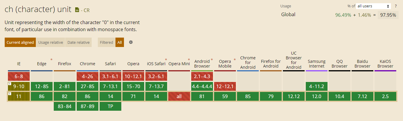
ex / ch
Next up, we’ve got ex and ch - very specific units that are really useful only when dealing with monospaced fonts.
ex is relative to the “x-height” of the current font, where “x-height” means the height of lower-case x character. ch on the other hand is relative to the width of the 0 character. So in both cases we’re dealing with character size measurement either in x or y axis. In case you’re wondering - yes, these units are affected by the element’s font-size.
Because usual fonts have characters of different heights and widths, you either have to have a very specific use-case for these units or be using a monospaced font and designing in relation to that (e.g. online code editor or something).
While the ex, just like % and other all the absolute units are supported pretty much across the board, ch is a bit worse, but can still be considered great (almost 98%):
Next up, we’ve got ex and ch - very specific units that are really useful only when dealing with monospaced fonts.
ex is relative to the “x-height” of the current font, where “x-height” means the height of the lower-case x character of the font. ch on the other hand is relative to the width of the 0 character. So in both cases we’re dealing with character size measurement either in x or y axis. Also, these units are affected by the element’s font-size.
Because usual fonts have characters of different heights and widths, you either have to have a very specific use-case for these units or be using a monospaced font and designing with that in mind (e.g. online code editor or something).
While the ex, just like % and other all the absolute units are supported pretty much across the board, ch is a bit worse, but can still be considered great (almost 98%):
For the Nunito font used on this website, with font-size of either 17px or 16px depending on the size of your viewport, here you can see these units in action:
10ex
10ch
em / rem
Finally, we’ve reached my personal favorites - em and rem. If you’ve ever designed a modern, responsive website, then you must have heard about and most likely used those.
em is a unit relative, or should I say equal to the font-size of the element. So if I’ve got font-size of 16px, that’s the value of 1em. In this way, these units are perfect for scalable designs while also having amazing browser support.
However, ems can be tricky to handle, as font-size is passed down to the child elements every time it’s set. Because of that you can quickly lose track of what the font-size is actually equal to (especially when setting the font-size itself with em, making it relative to the font-size of the parent). And that’s where rems step in.
rem (aka root em) is similar to its older sibling em in a way that it’s relative to font-size, but only of the root element (the one represented by the <html> tag). Using rems in your designs allow you to control all the sizing on your website, through one single property. It has a tiny bit worse support than em, but it’s also what I personally rely on and call the best relative unit in CSS.
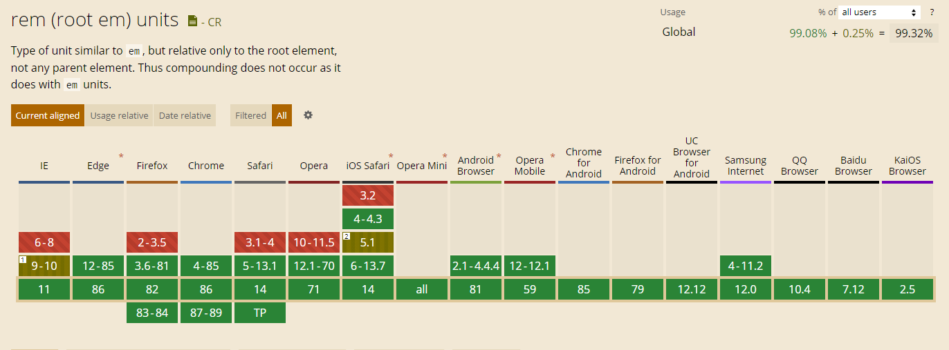
Here’s an example of both em and rem with font-size of either 17px or 16px depending on the size of your viewport. Keep in mind that font-size is set only at the top level of this website so don’t be surprised that they look the same.
10em
10rem
vh / vw / vmin / vmax
For the last relative units, we’ve got the “viewport-based” ones. The newest from the bunch, with slightly worse, but still nothing-to-worry-about support, delivering some functionalities that weren’t possible before.
It’s easy to know what each of these units actually means, by simply looking at their names. In each of them (`vh`, vw, vmin, vmax) the v part, like already mentioned, stands for “viewport” (the area of the - the most important ingredient of the units’ relativity. Everything after that refers to what exact spec of the viewport the unit is relative to - height, width, smaller dimension, and bigger dimension respectively.
All these viewport units are quite helpful when working with fixed and absolutely-positioned elements like modals and popup.
Support shouldn’t be an issue as it’s hanging at around 97%.
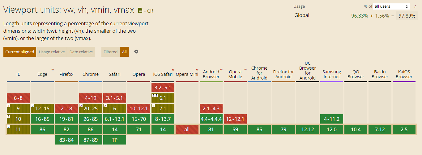
As for some examples - below you should see 2 pairs of equally-width bars which depend on your viewport you:
10vh
10vw
10vmin
10vmax
Other
With that, we’ve covered all of the CSS length units (from what I know at least), but there are still other kinds of CSS units that we have to explore!
Time: s / ms
Time units in CSS - seconds (s) and milliseconds (ms) are used with properties that require you to specify the duration of something, like animation or transition (and its “sub-properties”).
It’s impossible to demonstrate these with bars, so I’ll leave you with only the math that you almost certainly already know:
1s = 1000ms
Angle: deg / rad / grad / turn
In CSS, we can also stumble upon situations where we have to set an angle of some sort. For cases when transforms involving rotation or CSS gradients are involved, units like deg, rad, grad, and turn can be used. The most popular one - deg stands for degrees as we all know. The other three are also used in the real world - radians, gradians, and turns (360deg rotations).
Overall, I recommend sticking with degs, might you can use rads and grads if they really align with your specific needs (e.g. values that come from calculations in JavaScript). turns are really convenient, but they aren’t as popular as degrees, so it’s better to stick to what’s known.
As for how the math plays out:
360deg = 400grad = 1turn =~ 6.28rad
Unit syntax tips
Now, these were all, like really all CSS units that exist right now and that I’m aware of. Surely new ones might come in the future, and maybe I could miss some - if so just let me know in the comments below.
But as a little summary, I’d like to give you a few tips on how you should use these units - most of which you should be already subconsciously aware of even if you don’t know it:
- You can attach units to both integers and floats, e.g.
1cm,-1px,1.5s, whenever the given value makes sense (don’t do e.g-1s). - The value can be preceded by minus (
-), but also plus (+) if you’re into that, so both+1remand-2emare valid. - Unit names are case-insensitive so you can specify them like
1tUrNor1REM, but it’s a sane practice to keep them all lower-case. - No space is allowed between value and unit indicator.
- Unitless
0is not allowed for time-related units.
Bottom line
So, that’s it for this post! I think it was a fun one. CSS units are a pretty basic topic, but even such simple things can be somewhat interesting.
Still, I’m sticking to the basics, and for me a set of pxs, rems, %s, mss and degs is all I need and all I really use to create my designs. Maybe I’ll throw an occasional viewport unit here and there when dealing with certain elements, but that’s really all.
What’s your “standard” set of CSS units? Did you learn about a unit you didn’t know before? Do you want to see more of such basic, but interesting blog posts? Let me know in the comments below!
If you like what you’ve just read, follow me on Twitter, Facebook, or through my newsletter for more web development stuff. Thanks for reading and happy coding!
If you need
Custom Web App
I can help you get your next project, from idea to reality.