5 of the best VS Code themes compared - an opinionated review
Every programmer needs to have a code editor of his own. Whether it’s a simple text editor, terminal-based app or a full-blown IDE - you have to have one. With that said, you most likely know that recently (especially in the web development department), an open-source code editor from Microsoft - VS Code - has taken the majority of developers by storm!
Because of its impressive set of features, VS Code presents a unique choice for programmers. Not only has it a well-developed ecosystem of extensions, improving the day-to-day use, but it’s also themeable! In this way, you can either customize the editor on your own or use one of many themes available in the VS Code marketplace.
But, should you really care about how your code editor looks? Shouldn’t it be just a tool to “get the job done”? Well, I guess many people will have their own opinions, but - from my personal experience - I consider this “detail” a very important one. In my opinion, a good-looking tool can greatly influence how productive I am - the prettier the tool, the more likely I am to do something useful with it. Besides, as you’ll probably spend a lot of time using this editor, I bet you don’t want to continuously look at some piece of garbage (or at least something that you don’t like much) all the time!
So, in today’s post, I’d like to present to you with what I consider 5 of the best VS Code themes, that you can find and use for free through its marketplace! We’ll go over their strengths and weaknesses. We’ll compare them to determine which one is the best! Just keep in mind that some of my comments might be a bit opinionated (as all things are) so take them with a grain of salt. Let’s start!
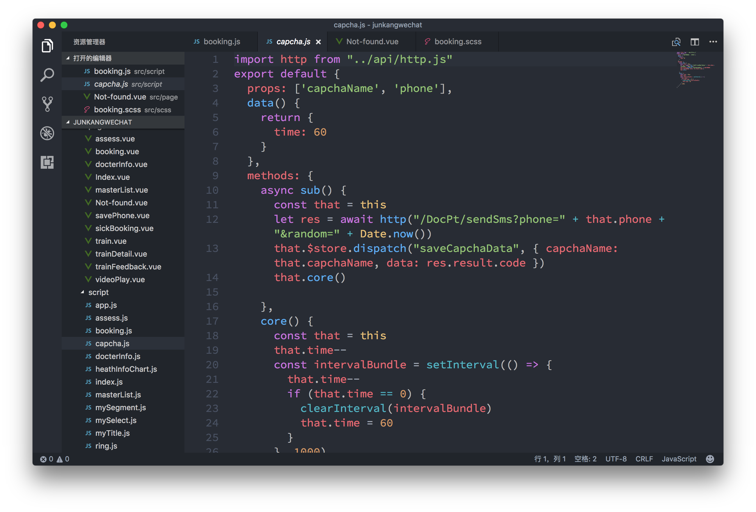
One Dark Pro

Starting with the most popular theme (according to downloads count) - we have the One Dark Pro. Coming at shy 12.5M downloads, this theme is based on the default theme’s color palette of Atom - another code editor. Now, the question is - where such popularity comes from?
In one of my previous articles, I compared the VS Code and Atom against one another. In this comparison, while VS Code was a clear winner in most categories, Atom deserved some kudos for its design and aesthetics. Even though VS Code looks great in general, it’s the Atom editor, that has won in the design category. Not only has it somewhat cleaner and more minimalistic UI, but also a well-balanced default theme - One Dark - for both actual UI and syntax highlighting. And that’s where One Dark Pro takes its inspiration from…
The overall look and feel of this theme is great! It comes in 3 variants - standard, bold and vivid, with each name being representative of some slight differences in the look of syntax highlighting. Just like in the original version - the theme is dark-only (Atom’s light theme is separate and it’s called One Light). Colors are well-balanced, and contrasts are right in place. With such a great theme - the choice comes down to personal preference.
I think One Dark Pro is a great choice for all of those who simply want to have a nice-looking theme and not worry about anything else. But, because I’m a little picky, I prefer themes that come in both light and dark variants. I use the light one during the day, while the dark one - during the night. I know that the name itself indicates that it’s not a light theme, but still… Surely you can find some spin-offs of Atom’s One Light theme, but it doesn’t change the fact this particular theme is not a “complete package”.
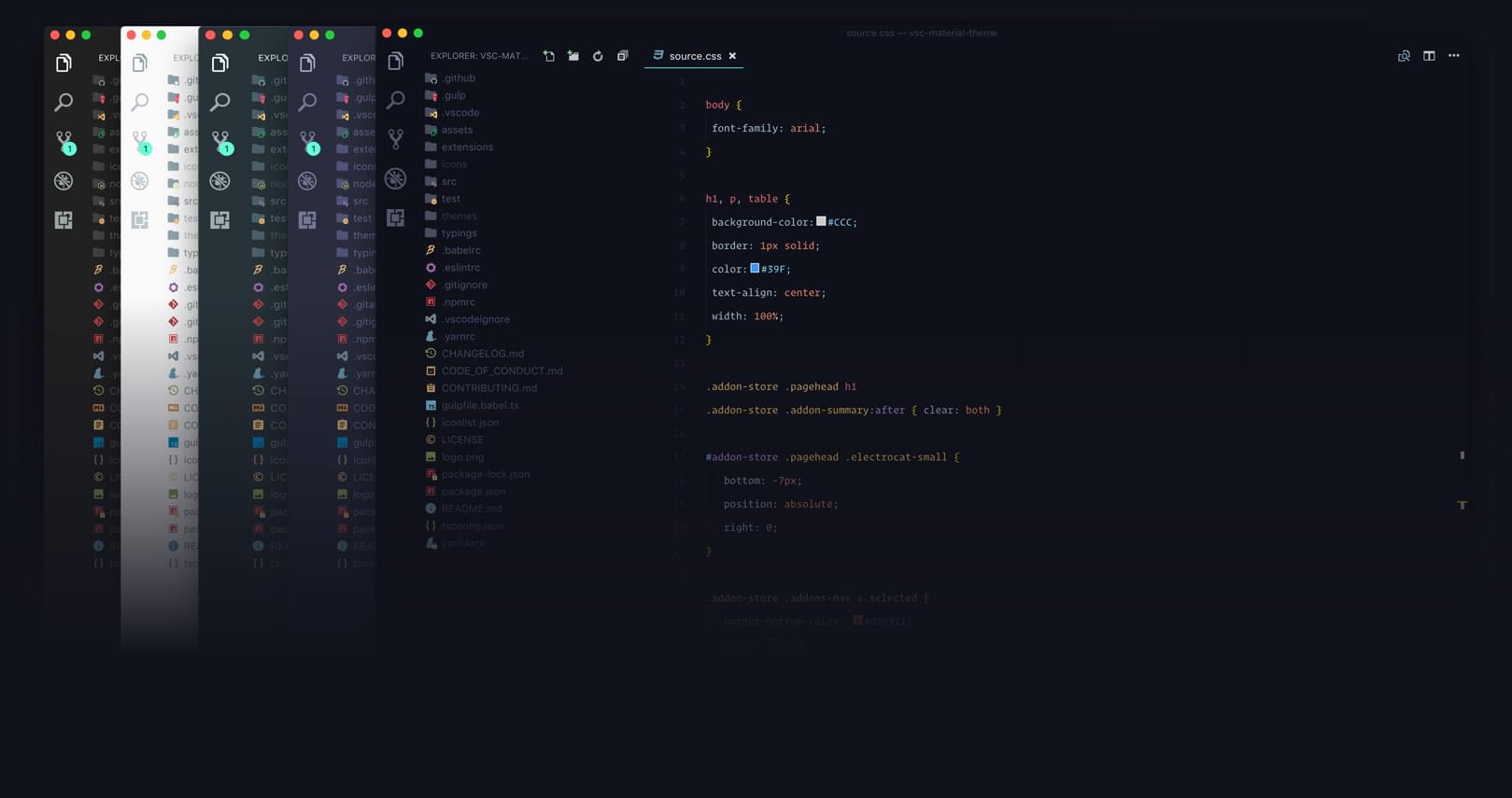
Material

The next popular theme is the one based on Google’s Material Design (MD) - Material Theme. It features a nice and minimalistic look - just like the MD empathizes. It comes in 5 variants - Light, Dark, Darker, Palenight, and Oceanic - with each of them having its respective “high-contrast” counterpart.
Material Theme has been my go-to for a long time - and for a good reason! When you think of it, Material Theme checks almost all the boxes required for a good theme. First, it comes in multiple light and dark variants (although it still favors the dark ones). Secondly, it gives you the ability to customize its accent color - a subtle but very much appreciated detail! It also follows MD guidelines (obviously), which I can only think of as an advantage. I like MD and think Google has done some great job working on it. Many modern web and Electron-based apps either use it directly or are inspired by it in one way or another. Material Theme is no exception.
The only reason I’ve switched is, again, because of the light theme. After using it for a certain amount of time, I started noticing smaller detail, e.g. how the contrasts are lacking. Little details like directory name in the integrated terminal, the text on the buttons of pop-up notifications or VS Code’s peek definition features - all were really hard if not impossible to distinguish or even see. And yes - I’m talking about the “high-contrast” version too! Anyway, if you’re not using the light themes, Material Theme might turn out to be a compelling option for you - especially in its lovely Palenight variant!
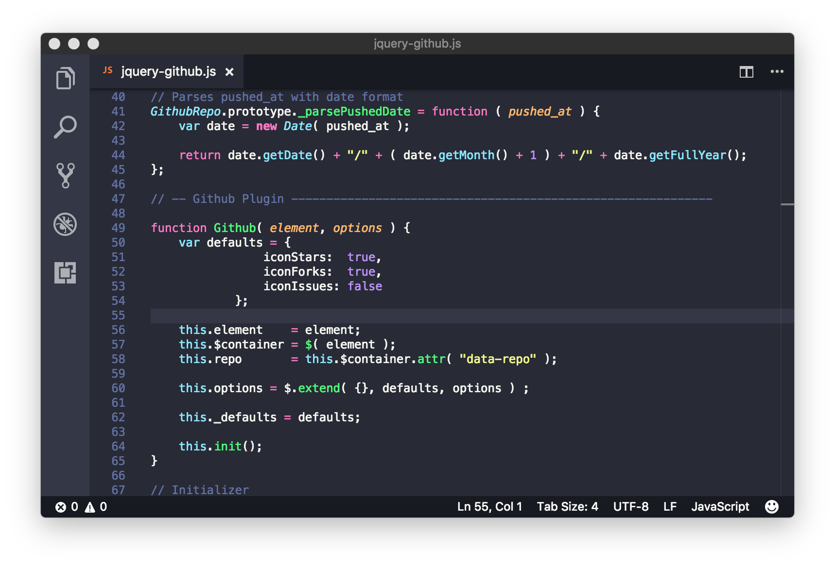
Dracula Official

A very popular theme named after a very popular vampire - Dracula Official is known and loved by many developers and “casual” users alike. Why’s that? Mostly because Dracula is a great theme, but also because of its portability.
While One Dark Pro might be a port of Atom’s One Dark, and Material Theme is an implementation of the much broader standard of a similar name, none of them is directly available for as many applications as Dracula. The Dracula theme project covers almost 50 different apps - including VS Code, Atom, Slack, Vivaldi (a web browser), and many more! If you’re using at least 2 of the supported apps, you might consider this theme just for the sake of consistency.
Vampires like Dracula don’t like light, and thus there’s not even a chance of having such a variant here. The only choice you’re getting is between the default and Soft variant, which features a bit more subtle, grayish syntax and icons’ color. Contrasts are certainly there and are very noticeable. The additions of some very dark colors, make the theme look great when used during the night. On the light of day, however, it can feel a bit… harsh.
Overall, I’d certainly recommend this theme to every fond of consistency and darkness vampire. ;)
Nord

Nord is a perfect example of what I call an oceanic theme. It’s perfect for those who want a non-light theme that’s not too dark, or just don’t like vivid colors. The theme empathizes on different variants of blue - both for its accent color and syntax highlighting.
Just like the previous theme on this list, Nord is very portable and made available across almost 35 different apps. It might not be as wide-spread as Dracula, but it’s certainly very portable.
The very thing that makes Nord special is its subtle syntax highlighting. Even though its north-blueish (that’s what they call it) colors are pretty soft, the syntax maintains a great level of readability and a good feel for the eyes. Certainly, if you prefer more vivid colors (like I do), or you simply don’t like blue - this theme might not be your best choice.
Horizon

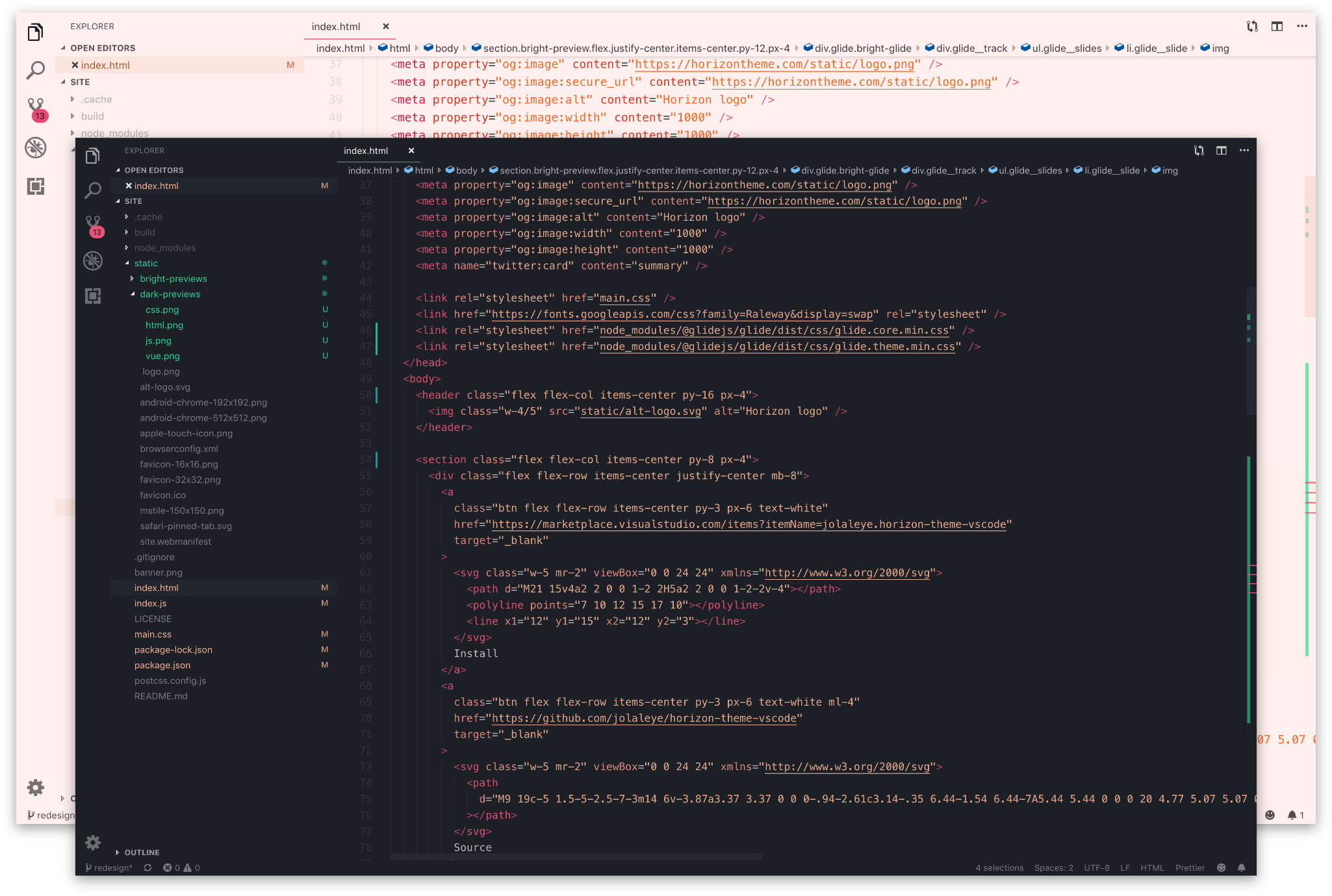
Finally, we’re closing the list with what’s currently my go-to theme - Horizon. Even though it’s last when it comes to downloads count (but it’s still around 400K), Horizon stands out from the rest with its great contrasts and color palette.
Horizon comes in light and dark variants, from which both have Bold and Italics options for syntax highlighting adjustments. The light theme is very good - especially when comparing it to other light themes on this list. It has great contrasts (everything is clearly visible), vivid syntax highlighting, and increased color temperature, to make it good for the eyes. The dark variant plays by similar rules. It stands-out with its vivid syntax highlighting and the use of some very dark colors. I’d say that those looking for a truly dark theme will be happy with it.
Overall, I consider Horizon to be the best theme on this list. Now, it certainly doesn’t provide all the goodies, like adjustable accent color or cross-app portability. But, with the inclusion of well-design light and dark variants, great contrasts and vivid syntax highlight, I’d say it provides the best “complete package” that one might want for VS Code.
Is there something missing?
So, that’s my list of the best VS Code themes. Like I said multiple times now, it’s quite opinionated and definitely won’t be the same for everyone. It’s natural that everybody has different needs and preferences. Still, if you haven’t decided on your favorite theme yet, or you’re just getting started with the VS Code, I highly recommend that you check out any of the listed options. Also, maybe there are some different themes that you use and want to share with others? If so, write them down in the comment section below!
If you want to stay up-to-date with the latest posts from this blog, be sure to follow me on Twitter, Facebook or through the weekly newsletter. As always, thank you very much for reading this piece, and have a nice day!
If you need
Custom Web App
I can help you get your next project, from idea to reality.