
Discussing carousel as a way of showcasing content
Imagine a situation - you’re building a website (or an app), which is full of content that needs to be showcased in some way. The possible solutions are a list, a grid, or a carousel. So, which one would you choose? I’ve faced such a problem when working on the redesign of my website. You know, I’ve got quite a few blog posts right here, and I’d like to present them nicely. That’s how the whole thinking process started…
At the time of writing, when you navigate to a page on my blog that’s meant to list some kind or group of posts, you’ll be greeted with either a list on mobile or a grid on larger screens - paginated when needed. It’s a nice, let’s say “usual” way of doing things.
But, when you’re doing some kind of redesign, you usually want everything to be plain better, which is often associated with some drastic changes. The reality is that new or different doesn’t always mean better. It’s just something inside our human brains that makes us desire new and unique things all the time. There’s a great chance that something like this has happened to you before. Either way, I just wanted to provide some context as to why I even started to think about implementing a carousel.
Mobile-first
So, in my designs, I always follow the mobile-first rule. Not only because that’s where most of my viewers come from, but also because I find it a lot easier. Back in the day, the mobile-first ideology wasn’t so popular. Mainly because developers had a hard time adapting their designs to fit smaller, touch-sensitive screens, not mentioning Flash-related issues and all the other stuff.
Nowadays, I find myself having a harder time designing for desktop, rather than mobile. The sole pressure of using the available space appropriately is just that high. Anyway, that’s why I make most of my design choices based on how things look and work on smaller screens.
A carousel as a way of displaying content feels very natural and intuitive on mobile devices - given the proper controls. You should be able to mindlessly swipe right or left to view all the content with ease. You should see the next and previous elements of the carousel, just so you know what’s coming. That’s how a perfect mobile carousel should work - generally speaking. Because when taking a closer look, you’ll see that there’s a lot more to consider…
Pros and cons
If you’ve faced a similar problem before, then you’ve most likely searched the web back and forth, only to discover a lot of information about how bad carousels can be. Most of it is probably true, but let’s try to take an even more objective perspective and see how carousels stack up against their alternatives.
View
Some studies show that most people, when interacting with carousels, view only the first few of its items. While it’s certainly true, let’s compare it to a list or a grid. Doesn’t the same effect take place here too? Viewers won’t scroll your list forever - the same applies to a grid. And, when you introduce pagination (not possible for carousels), the situation becomes even worse.
So, there’s no clear winner in this “category”. However, a grid, an infinite list or both of these solutions combined (infinite-scrolling grid) have an obvious advantage over a carousel. They’re able to present more content at once and can be easily enhanced to make user’s action more enjoyable. Yet still, you have to remember that any piece of content that requires the user to take action in order to view it, could be left unseen.
Focus
Now, the fact that lists and grids can display more content at once is both their pro and con at the same time. Imagine a scenario where you’d like your user to focus solely on one of your items. Grid is surely not ideal for this kind of use-case. A list, depending on the size of your items can be “snapped” to a given position, but it doing so doesn’t feel good. You could implement some kind of zooming or lightbox functionality, but it would require a touch/click action from the user to view it, and additional action if he were to visit the linked page (which is often the case).
A traditional carousel focuses only on one element at a time. It can provide the user with a preview of what’s on its right or left side, but it definitely won’t be main the focus point. A single tap/click will be enough for the user to perform a given action and no additional functionality is required.
Controls
List or grid controls are fairly easy to do. In fact, you’ll just need a simple container for all the items and the browser will automatically handle the scrolling mechanism for you. It’s both straight-forward for the developer, as well as to the end-user. If you have a lot of items, then you can either use pagination or an infinite-scroll mechanism. The first is simpler for the developers, while the second - for users. Either way, it’s quite simple to get things right.
As you might already suspect, things are looking different for carousels. There’s almost nothing done automatically. Maybe CSS Scroll Snap feature, together with vertical scrolling will make things better, but right now, its cross-browser support leaves a lot to be desired.
So, you’re left on your own. You have to implement touch (swipe) controls, mouse scroll, and optionally even arrow keys support. It might not be that hard to do, but it’ll take a lot of time to get it right.
A11y
The last thing to consider when making your decision is accessibility. Depending on your targeted audience, you have/don’t have to think about a11y. As my blog is targeted towards web developers and programmers, I don’t focus on making it as accessible as it could be. But, if you’re creating e.g. a social platform, a news website or something similar, you’ll need to take it seriously. And it can be pretty hard to do it properly.
First, you have to make the most out of all the previously discussed categories. You have to provide a great and readable view and controls. You must also depend more on static HTML (together with the use of ARIA), and CSS, to allow browsers to properly optimize your website. JavaScript can also be useful, but only when used properly - e.g. handling more control inputs, rather than doing the fancy client-side rendering.
All of that and a lot more doesn’t make carousels very a11y-friendly. Thus, if you’re taking this stuff seriously, you’ll be better off with a list or a grid.
Desktop
By now you most likely have noticed, that when talking about carousels, I focused primarily on mobile devices. The reason for that is simple - carousels are straight-up awful on a desktop! Unless they’re meant to work automatically with no user interference, you shouldn’t even consider them an option. Why? Well, tell me how you’re meant to interact with such a creation on a desktop? By mimicking its mobile controls and dragging its items with a mouse? By inaccurately controlling it with a mouse scroll? Or by forcing the user to use arrow keys and make him concentrate on that instead of the actual content? So, I think the best solution for carousels on desktop (if you’re really that stubborn) is to implement a good mouse scroll + snap solution. But, if you have time and patience, just leave a carousel on mobile and create a dedicated list/grid layout for desktop.
The winner
With all that said, who’s the winner? Well, I really like the way carousels look on mobile, and I tried to implement them in my website redesign. Using my UI framework, I’ve created a dedicated carousel component. I’ve handled touch input and mouse scroll. I’ve also implemented a snapping mechanism. The result looked somewhat like this:
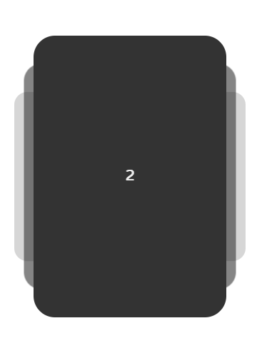
Now, with that screenshot, you should be able to imagine such a carousel in use on mobile, but not so much on desktop, right? I tried to somehow make it look and feel better on larger screens, but with no success. On mobile, the carousel was meant to occupy the whole screen. And on desktop - even when reducing the screen estate by half - it still didn’t look compelling. Controls also left a lot to be desired. I could use my time to create a dedicated grid layout for desktop while keeping the carousel on mobile, but I didn’t. Such a solution would require a lot more time and effort, wouldn’t be too responsive and would be hard to maintain in the long run. A mix of an infinite list and grid layout is much easier to pull off. Simple flexbox handling and you’re done. That’s why, in the end, I decided to abandon the idea of a carousel completely.
What do you think?
So, this was a bit more of a design problem/story-telling kind of post. If you’ve been in a similar situation before, I hope that this experience of mine will help you make better design choices in the future. Carousels aren’t all that bad… for certain use-cases. So, just don’t throw any idea out of the window before you deeply analyze it against your project’s needs.
Have you had a similar experience when designing your app/website? If so, let me know down in the comments. Also, if you like this article consider sharing it and following me on Twitter, Facebook, Reddit or through a weekly newsletter to stay up-to-date with my latest content. Finally, if you haven’t already, go check out my first YouTube video, (about JS Console API) and drop a like or a sub to show your support! Thanks for reading this piece and I wish you a happy day!
If you need
Custom Web App
I can help you get your next project, from idea to reality.