Flat Design vs Material Design - what's it all about?
When creating an app, a website, or any other kind of visual and interactive experience, there’s a lot of decision-making process involved. Things like layout, content and the overall design have striking effects on what your end product will looking like. If you want your project to succeed, you need to make wise choices, and believe me - it’s not so easy. Entire multi-page guidelines have been created, only to ease out some pain from doing such things And that’s something that we’ll be taking a closer look at…
In today’s article, we’ll discuss 2 of such guidelines, or should I say design systems, which are called Flat Design and Material Design. What are they, what’s their purpose, and which one you should choose (if any)? Without further ado, let’s get started!
Some history
So, in the beginning, there was chaos, and… you pretty much know the rest of the story. But seriously, when the era of websites and apps as we now know and love them started, there was almost no consistency between them (besides ubiquitous GIFs). Don’t get me wrong - it’s not like now they’re all looking the same, but at least they share some basic principles like readability, balanced color palette and sometimes even whole design systems!
Design system

Speaking of design systems, what are they exactly? To put it simply, a design system is a collection of rules, principles, and constraints, that come together to form a well-rounded design guideline. A good design system should be like an ecosystem, where all the products feel similar and connected. It’s a very basic description, but if you want, you can learn more about this interesting concept in this great Muzli blog post.
Skeuomorphism
Skeuomorphism is one of the most influential design systems that has ever been used in virtual user interfaces (UIs). The main idea behind it is to make virtual elements feel, look and represent their real-world counterparts. It involves heavy usage of shadows and gradients.
The skeuomorphic design allowed users accustomed to real-world objects to easily transition to the virtual world. A great example of that is the original iPhone with its iOS (then iPhone OS) operating system from 2007. Its UI let users feel like home when reading their virtual e-books or scrolling through their contacts list.

Given the fact that the iPhone and iPad were the first of their kind, they inspired a lot of following designs and trends. The use of skeuomorphism seen its peak with the rise of mobile devices, but it came crushing-down soon after, with products like Windows 8 (2012), iOS 7 (2013) and Mac OS (2014) switching to a different design system.
With that said, skeuomorphism still has quite a few applications and supporters backing it up, just not as many as it once had. Why? Mostly because of its fundamental principle. It turns out that mimicking real-world objects in the virtual world can, to put it simply, be quite limiting. With modern UIs becoming increasingly complex, a change had to be made.
While the more modern design systems have experienced a mostly positive response (especially from the younger users), some wish for skeuomorphism to return. Personally, I like the current design trends as they are, and don’t see a way for the “old” ones to make any noticeable comeback. But who knows? Only time will tell…
Flat Design
With the fall of skeuomorphism, a new design system took its place - Flat Design. In terms of its philosophies, it’s can be perceived as a complete opposite of skeuomorphism. It empathizes on a simple, minimalistic design and limits the use of shadows and gradients to a minimum.
As the name implies, Flat Design involves the use of mostly flat elements and colors, together with simple typography. It made it easier to create adaptable UI designs for the variety of devices that we use today. No longer bound by skeuomorphic principles, designers started using abstract forms, that don’t exist in the real world. Basically, one big, drastic change.
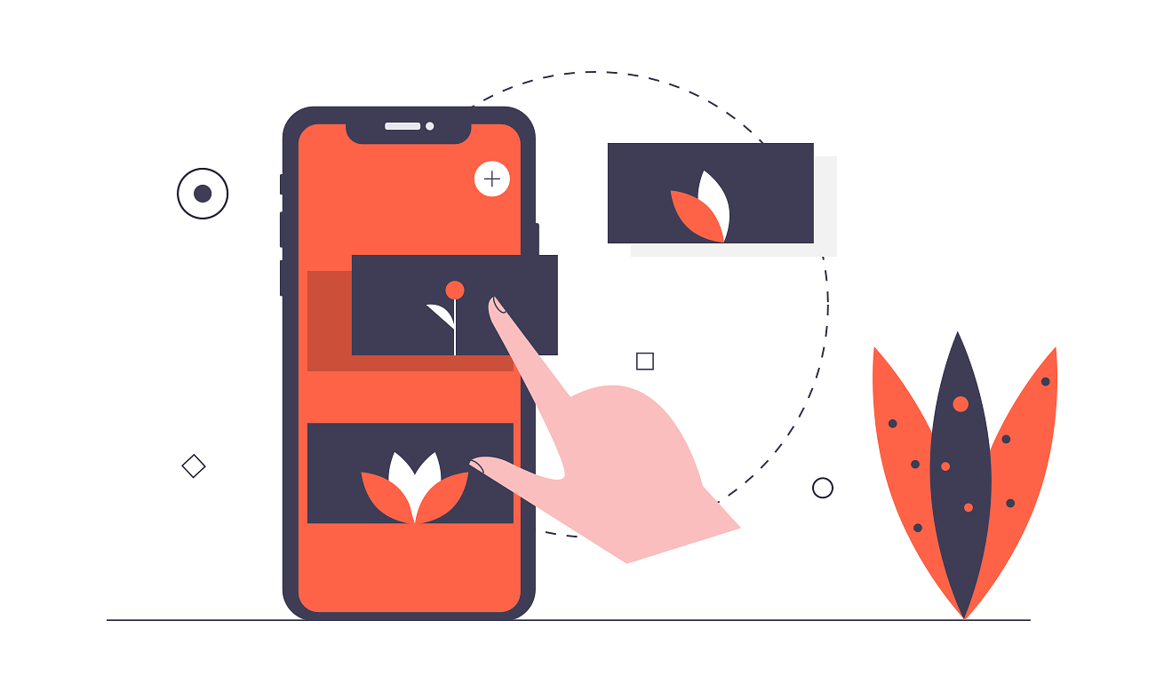
But Flat Design doesn’t come without its cons. Many users say that it makes UIs feel less usable and counter-intuitive. Having all elements being flat, without any shadows and other visual effects can make them hard to distinguish from each other, and thus spread confusion.
To counter the rising concerns, in 2014 Flat Design specs were slightly adjusted, with the result being Flat Design 2.0. The revisioned specs allow the use of subtle shadows and gradients which let designers follow them more closely without as many problems as with the original version.
Nowadays, Flat Design is probably the most wide-spread design system out there. It’s used in many mobile and desktop OSs, apps, websites, illustrations, and other graphic materials. Although not all of these products implement Flat Design “line by line”, they certainly take inspiration from it, and only make some slight adjustments.
Material Design
As I said, many modern design systems are more or less inspired by their predecessors. The same can be applied to Material Design - Google’s own design system released back in 2014. It can be considered a happy middle-ground between skeuomorphism and Flat Design (with a slight tilt towards the second one).
The main idea behind it, telling from the name alone is the material. Inspired by real-life paper, the material can be freely expanded and formed - something that’s not possible in the real world. The material is also meant to be perceived as a physical surface that exists in 3D space, and thus casts shadows. And it’s this very concept that the whole design system builds upon.
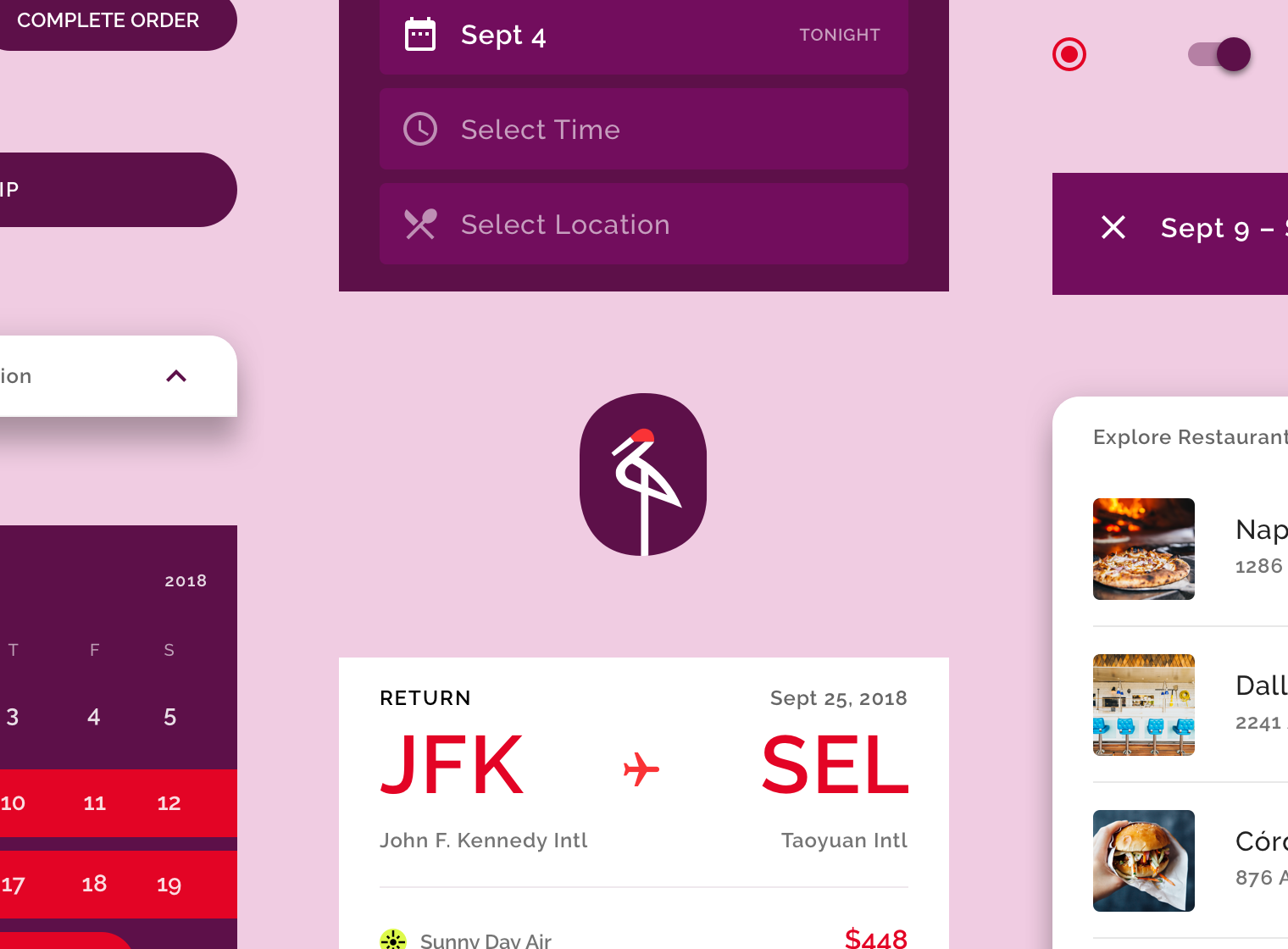
Material Design exploded in popularity with the introduction of Android 5 (Lollipop). Since then, it’s been adopted in the majority (if not all) of Google’s products line-up, but also by numerous 3rd-party developers. It turned out that people really like Google’s balanced approach to design. This fact, backed up by extensive and well-rounded documentation, resulted in Material Design winning hearts of many designers and developers. The best proof of that are countless component libraries and websites adopting the system.
In 2018, building upon its success, Google announced the next version of Material Design. It was a response to the ever-growing community of the design language, that demanded more flexibility. Thus, Google expanded its guidelines to include more mature theming functionality. By now, these changes have proven to be the right move, and Material Design is staying strong.
How to choose?
So, is there a proven method of choosing the right design system for your next project? Well, of course no - what did you expect? Everyone has different needs, personal preferences and targets different audiences. It’s up to you which design system you’ll choose - if any.
Flat Design and Material Design are only two of the most prominent choices. There’s a lot of different design systems out there in the open, just waiting for you to try them. Even skeuomorphism is still an option. But, if I was to choose between the two, I’d say go with Material Design for websites and apps, and Flat Design for illustrations and all the other stuff - especially if it’s meant to be printed. Of course, that’s just my opinion.
Go, check out different implementations of both design systems, and decide for yourself. And if it’s too hard for you, maybe you should consider them only as a source for inspiration? Such an approach can let you to creating your own unique design that would set your brand apart from the competition and make it more recognizable.
What do you think?
This was just a quick overview of a very broad topic. Hopefully, I’ve managed to provide at least some guidance to those new in this field. Let me know your thoughts in the comments below! Also, if you like my writings, consider following me on Twitter / Facebook / Reddit, or through my weekly newsletter, to stay up-to-date with the latest content. Thank you so much for reading this piece and I wish you a great day!
If you need
Custom Web App
I can help you get your next project, from idea to reality.