Tailwind JSX and class composition
After my initial look at Tailwind CSS, I haven’t used it much. Like I’ve stated in my previous blog posts, my feelings around Tailwind were mixed. I appreciated the utility-first, constrained design but didn’t like how its classes “bloated” my HTML code or how tedious the configuration process was.
Tailwind v2.0
With that said, I’ve taken another look at Tailwind while working on my product - CodeWrite (blogging tool for devs). I built it with Vue 3, and as there weren’t any good UI libraries available for it at the time, I decided to go with Tailwind.
Now in v2.0, Tailwind didn’t change much. However, after suffering the initial configuration pain, I experienced how it’s like to use it in a mid-size codebase. And to be honest, it was pretty good! I got around the className “bloat” by adapting my formatting config, and with good autocompletion for Tailwind classes in WebStorm, the workflow was pretty smooth.
Class composition
However, one new issue that popped up as the project grew was related to creating new components.
In Vue, there’s a nice feature that auto-passes DOM attributes to the top component node automatically, and I used it quite often. It might not be the best practice, as it can be bad for scalability, but it can work wonders if you use it properly.
With that said, it’s not so easy with Tailwind. Because all the utility classes are ordered automatically, you won’t be able to override the “default” ones when, e.g., you want to change Button component’s padding.
This issue of utility class composition is known to many Tailwind users. Sadly, there’s no clear solution for it, and everything available is just a bunch of workarounds. Unless something changes in Tailwind’s architecture or the very nature of CSS (doubtful), we have to do with what’s available.
Workarounds
So, how can we work around this issue? Well, there are a couple of ways, starting with simply abandoning class composition completely…
Abandon class composition
Without class composition, you lose some flexibility and pretty much have to write some additional code. However, it can also lead you to create a more stable and scalable base for your components.
That’s the route I went with. I analyzed all ways in which I may have to change the component to fit all its use-cases and integrated them into prop-based config. Then, this config is used together with a small utility function for generating the final className string.
@apply directive
Another solution would be to use the @apply directive to extract your component’s base styles (before other Tailwind classes). This way, you’ll be able to override the styles whenever you’d like easily.
However, you’ll still be limited to do overrides only once, and this solution rips your CSS utility classes from your HTML/JSX to an external CSS file, which might not be what you want.
twin.macro
Lastly, you could use a library called twin.macro or similar. It “blends the magic of Tailwind with the flexibility of CSS-in-JS It’s a Babel Macro - a kind-of utility function that gets processed by Babel at compile-time and results of which get inserted right into your code. In this case, it processes Tailwind utility classes into CSS string that can be used with your CSS-in-JS library of choice (emotion, styled-components, goober).
import tw from "twin.macro";

const Input = ({ hasHover }) => (
  <input css={[tw`border`, hasHover && tw`hover:border-black`]} />
);
The way this works is that with your CSS string, you essentially do something similar to the @apply directive but at the JS-Babel macro level. With the generated CSS string and the power of CSS-in-JS, you create a new CSS class - one that won’t collide with any ones that come after it.
This method truly solves the composition issue. It does involve some more runtime processing and requires the use of the Babel macro, but can add a lot of flexibility to your code, without any other drawbacks.
Tailwind in runtime
So, it seems like twin.macro is has a lot going for it. How about we take it a step further?
Clearly, CSS-in-JS is the solution to class composition in Tailwind. However, twin.macro only scratches its potential and is limited by the possibilities of Babel macros. You have to import it properly (constant import tw from 'twin.macro', at the top of every file without the possibility to auto-insert or re-export it), and the autocompletion is crippled. Sure, it saves some runtime performance, but what if we’re willing to sacrifice it to get an even better development experience?
What would you say about hypothetical “Tailwind JSX”? A library where your class utils become JSX props, a one that integrates beautifully with your JS framework of choice, provides great autocompletion when in TSX, and can be composed with ease thanks to the power of CSS-in-JS?
Well, “Tailwind JSX” doesn’t exist, but there are libraries that do exactly what I’ve just described - let’s check them out!
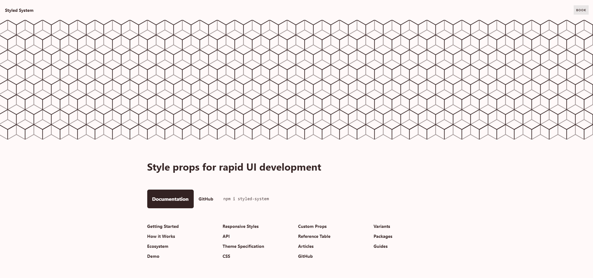
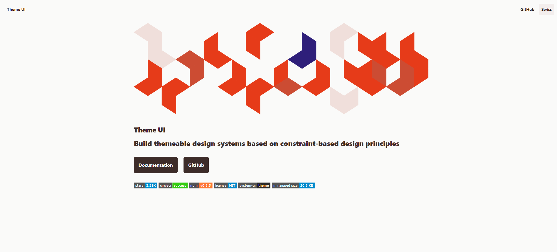
Styled System / Theme UI

Styled System is a React library that leverages props for UI development.
It’s kind-of like Tailwind but for JS. It allows you to define a theme for “constrained design”, create custom props that can be used throughout your UI, and do all that in a way familiar to React users - through props and styled-components.
import styled from "styled-components";
import { space, color, layout } from "styled-system";

// creating a configurable Box component
const Box = styled.div(
  {
    boxSizing: "border-box",
    minWidth: 0,
  },
  space,
  color,
  layout
);

// example usage
<Box width={[1, 1 / 2]} p={4} mb={3} bg="tomato">
  This is a tomato box, with responsive width, some padding, and margin bottom
</Box>;
Sadly, the development of Styled System seems kind-of stale. Theme UI can be considered to be its “spiritual successor”.

It’s developed by the same System UI team, has more features, but utilizes a single sx prop instead of multiple as its predecessor.
/** @jsx jsx */
import { jsx } from "theme-ui";

// Notice custom jsx pragma for handling sx prop.
const Example = (props) => (
  <h1
    sx={{
      color: "primary",
      fontFamily: "heading",
    }}
  >
    Hello
  </h1>
);
Personally, I preferred the Styled System’s approach, but Theme UI is still pretty nice.
XStyled

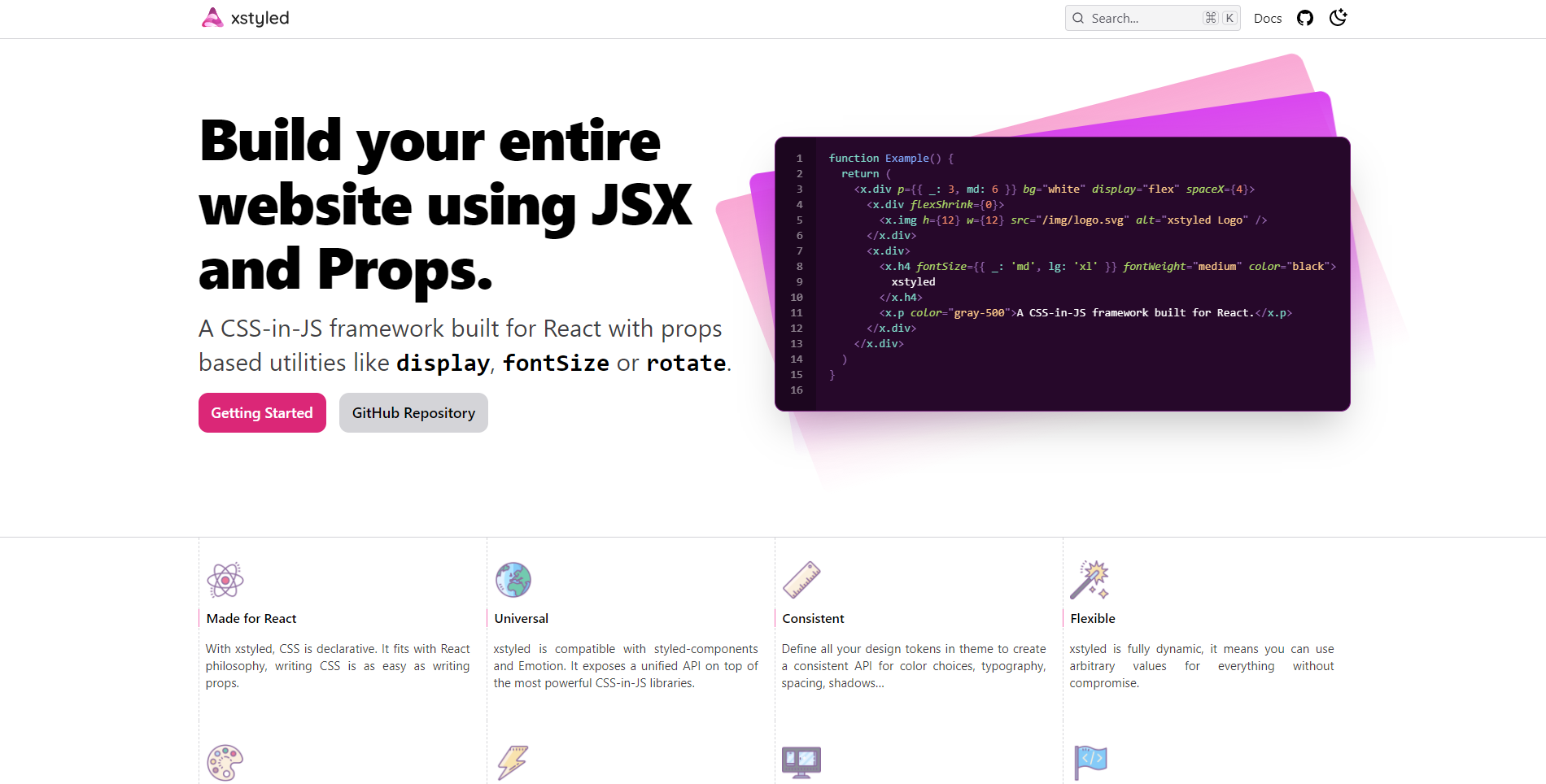
Now, XStyled is pretty much the closest you can get to “official” Tailwind JSX. Its docs look familiar, and the author openly states its Tailwind inspiration.
XStyled goes alongside React and either styled-components or emotion as an “addon” on top of them. It functions fairly similarly to Tailwind and Styled Components - you’ve got all your “utility props”, you can use them on x-namespaced elements, and there’s a config for constraint design as well.
const Example = () => {
  return (
    <x.div p={{ _: 3, md: 6 }} bg="white" display="flex" spaceX={4}>
      <x.div flexShrink={0}>
        <x.img h={12} w={12} src="/img/logo.svg" alt="xstyled Logo" />
      </x.div>
      <x.div>
        <x.h4
          fontSize={{ _: "md", lg: "xl" }}
          fontWeight="medium"
          color="black"
        >
          xstyled
        </x.h4>
        <x.p color="gray-500">A CSS-in-JS framework built for React.</x.p>
      </x.div>
    </x.div>
  );
};
XStyled caught my attention pretty quickly. Its docs are detailed and TypeScript autocompletion mostly works.
However, some utilities have pretty verbose names that I couldn’t get used to after working with Tailwind. E.g. I had to use position=”fixed” instead of fixed like in Tailwind, but it’s just a nit-pick that you can overlook.
Chakra UI

Lastly, Chakra UI is the most popular out of the bunch (based on GitHub stars at least) - and for a good reason. It’s like a combination of the best of all previously-mentioned libraries, with a whole UI library on top of it!
Chakra UI combines the “utility-props” similar to ones seen in XStyled (but with more shorthands this time - position = pos), with the easy configuration from Styled System, and additional sx prop in case you’d need it. All that, and a whole library of ready-to-use, accessible and highly-configurable components (they can use all utility props). Basically, an all-in-one package with everything you could want from the best version of runtime-based Tailwind!
import * as React from "react";
import { Box, Image, Flex, Badge, Text } from "@chakra-ui/core";
import { MdStar } from "react-icons/md";
export default function Example() {
return (
<Box p="5" maxW="320px" borderWidth="1px">
<Image borderRadius="md" src="https://bit.ly/2k1H1t6" />
<Flex align="baseline" mt={2}>
<Badge colorScheme="pink">Plus</Badge>
<Text
ml={2}
textTransform="uppercase"
fontSize="sm"
fontWeight="bold"
color="pink.800"
>
Verified • Cape Town
</Text>
</Flex>
<Text mt={2} fontSize="xl" fontWeight="semibold" lineHeight="short">
Modern, Chic Penthouse with Mountain, City & Sea Views
</Text>
<Text mt={2}>$119/night</Text>
<Flex mt={2} align="center">
<Box as={MdStar} color="orange.400" />
<Text ml={1} fontSize="sm">
<b>4.84</b> (190)
</Text>
</Flex>
</Box>
);
}So, you’ve got all the ways to create your components you could possibly want, you’ve got a large collection of ready-to-use components, and a slew of other features. TypeScript support is great (there’s even a special CLI tool to generate typings for where it wouldn’t otherwise be possible), and my only complaint I guess is that it’s for React only.
Thoughts?
What do you think about all these runtime JSX-based Tailwind alternatives?
Personally, I think they’re really onto something. The development experience they provide is just on another level. Chakra UI is obviously the best of the bunch, but others are close.
With that said, Tailwind still has a lot going for it. It’s the least verbose of the bunch, its naming scheme is great to use and easy to remember, it doesn’t involve any JavaScript processing, and - most importantly for me - it’s framework-independent.
So, because of my love for Vue 3, I’ll be sticking with Tailwind and class composing utilities of my own. I might consider using twin.macro or even building “my own Chakra UI” but for Vue, but that’s something for the distant future.
If you want to start your own dev blog or bring your existing one to another level (and see Tailwind CSS and Vue 3 in action), checkout CodeWrite - the best code-blogging tool - it’s free!
Also, for more web dev and Tailwind content, follow me on Twitter, Facebook, or through my newsletter. Thanks for reading, and have a nice coding!
If you need
Custom Web App
I can help you get your next project, from idea to reality.