Simplistic static websites with Docking.js
Static websites are recently surging in popularity. Thanks to their very simple nature, they’re not only easier to create but also cheaper to host, more secure, and have better SEO out-of-the-box when compared to dynamic or client-side rendered websites. Thus, it’s only natural that we see more and more services, frameworks, and libraries dedicated to this sole purpose.
So, to not be left behind, I’ve recently created my own Static Site Generator (SSG) called Docking. It’s a very basic, but capable SSG based upon Node.js and Isotope - my own UI library.
In this tutorial, I’d like to walk you through the basics of creating a Docking-based static website of your own. Let’s begin!
Setup
Docking is extremely easy to set up. All you need to do is to create a new project (through npm init or any other package manager) and install several packages:
npm install @isotope/core @isotope/prototope @isotope/dockingBy doing this we install not only Docking but also 2 other libraries - Isotope being the main UI library and Prototope being a utility-based CSS-in-JS library to go along the two others.
Now, all we need to do is to create the correct folder structure. Docking depends on a quite strict and opinionated, but also logical and understandable folder structure to allow you to quickly set up your project.
- assets - A folder for all kinds of static assets - CSS files, images, and whatever - which are then copied directly to the output.
- components - A folder containing Isotope components for use throughout your static website
- content - A folder for all your Markdown content, which is meant to be then processed directly to HTML output.
- template.html - A basic HTML template file contain basic elements like
<head>and<body>that you’d like to include in every generated page. - docking.json/.ts/.js - Docking configuration in a form of JSON, JavaScript, or TypeScript file.
With all that in place, you can also include the following commands in your package.json to ease out the process of calling Docking:
{
  // ...
  "scripts": {
    "watch": "dck watch",
    "build": "dck build"
  }
}
And that’s it - it’s really that simple!
Basic files
Docking requires you to have at least the template.html in place. However, it’s a good practice to create the configuration file as well.
So, in our template.html file, we’ll place a very basic responsive HTML boilerplate:
<!DOCTYPE html>
<html lang="en">
  <head>
    <meta charset="utf-8" />
    <title>Docking.js example</title>
    <meta name="viewport" content="width=device-width, initial-scale=1.0" />
  </head>
  <body></body>
</html>
Docking will then automatically insert generated pages’ content into the <body> tag of the template.
As for the config, you can leave it as an empty docking.json file:
{}The configuration file in Docking doesn’t do much on its own. Here, you can configure the Prototope library with prototope property (which we’ll talk about in a moment) and activate caching with cache: true to speed up incremental builds. However, this file is meant mostly for you to store your custom config values for later reference throughout your website. We’ll explore that a bit later.
Content
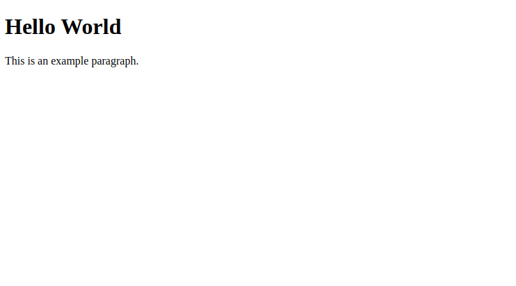
Having set up all the basic files, we can finally start creating some actual content. Let’s start by creating a simple index.md file inside our content folder.
## Hello World

This is an example paragraph.
Docking maps Markdown files from the content folder directly to the output and so the index.md file becomes index.html in the end.
In this way, all the routing is handled in the simplest possible way. You don’t need to do anything, but to structure your content in the content folder correctly. All the Markdown links are also automatically mapped to their HTML counterparts so that you not only have a functional website but also an easy to navigate Markdown database.
If you haven’t already, you can now execute the npm run watch command, and see your live development server start running (most likely on 3000 port). The website should reload on any change, with only a few caveats.

Components
Now, although Markdown is pretty nice when working with content-heavy websites, we still need some way to make our content more interactive and visually pleasing. For this purpose, Docking uses components.
Basics
Components in Docking are essentially the same as in pure Isotope but placed within own, dedicated files. If you don’t know how Isotope components work, you can either check out the docs or the tutorial I’ve written earlier, but I’m sure you’ll catch up as we go on. That’s because these components are essentially simple functions - there’s no fancy syntax or anything else you’d have to learn.
To create a new component, you have to go the components directory, and there create either a JS/TS file or a directory with index JS/TS file inside it. Docking handles bundling and TypeScript compilation for you so you can go with either of the languages and even a modular directory if your component grows very big. Here, it’s important to use a unique and understandable name for your file/directory, as it’ll be later used to reference the component.
Boilerplate
I’ll go with a simple header.ts file for my component should be used as my website’s header.
import { ComponentFunction } from "@isotope/docking/lib/declarations";

const component: ComponentFunction = () => (parent) => {
  return parent.div();
};
const type = "static";

export { component, type };
Above you can see my component already set up. Let me walk you through all the basics.
First off, my actual component - a function - is stored within the component variable/constant. Because I’m using TypeScript, I take advantage of ComponentFunction type provided by Docking, to get intellisense and all the other perks.
The component’s function is essentially an Isotope component that takes parameters i.e. it’s a nested function. Because we don’t plan to use any of Docking-provided arguments inside our component just yet, we use an empty arrow function (() => {}) to make our component work. Then, like with any Isotope component, we get access to the parent node, which we then use to form our actual component. Currently, we only use a basic <div> tag.
After the component function, we create the type variable. This is a cool feature of Docking components. The component’s type defines how the component will be used. It’s a string and can be equal to one of 3 values: "static", "dynamic" or "universal". And so, if a component is “static”, then the component’s code is executed only during the page’s build-time, resulting in a “pre-rendered” HTML fragment. However, if the component is “dynamic”, its code is executed only on the client-side, and if it’s “universal” - it’s executed on both sides. I hope you get the idea. It essentially allows you to build both dynamic and static features into your website without much effort.
Lastly, we export both the component and type variables. The variable names here are important - you cannot use any different names (unless you use export ... as ...). The type can be optionally omitted, resulting in the default use of "static". In this case, when you’re only declaring the component function, you can use export default (although it’s generally not recommended in JS as a whole). Overall, the above boilerplate is the cleanest solution.
Prototope
Now, our component’s boilerplate is working, but it’s not doing much. An empty <div> tag is most likely not what we envisioned for our header. To fix this, we’ll have to apply some styling. In Docking, you can style your elements in 2 different ways - either through standard CSS file which you can load from assets or through Prototope.
Prototope is a utility-first CSS-in-JS library to go along with Isotope and Docking. It features a set of simple CSS utilities (inspired by Tailwind CSS) which you can use right in your JavaScript/TypeScript Isotope application.
To get started with Prototope in Docking, all you need to do is to import the required CSS utilities from the library. You can then use them like any other Isotope directives, by supplying them during the initiation of a new node (with e.g. .div()) or with the .$() method.
import {
  bgColor,
  fixed,
  h,
  left,
  top,
  w,
  flex,
  justifyCenter,
  itemsCenter,
  textXl,
} from "@isotope/prototope";
// ...
return parent
  .div([
    bgColor("light"),
    fixed,
    flex,
    justifyCenter,
    itemsCenter,
    textXl,
    h(16),
    w("full"),
    left(0),
    top(0),
  ])
  .text("Docking.js example");
// ...
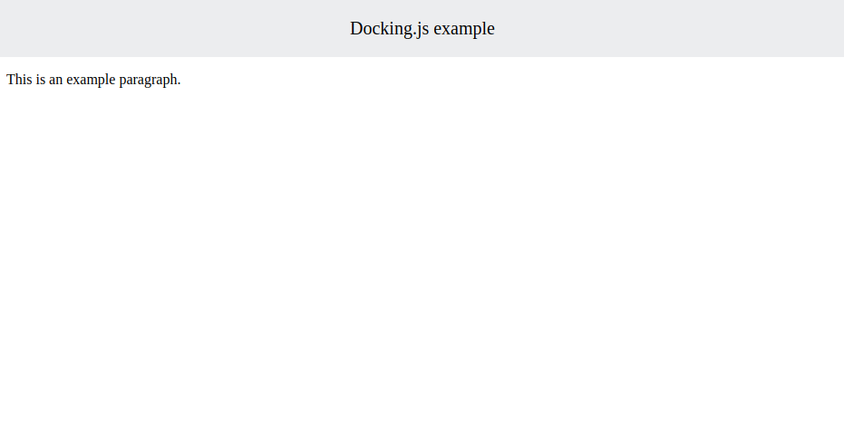
Because of the nature of Prototope’s CSS utils, the above snippet should be pretty self-explanatory. Utils’ names clearly state what they do. And so, above we create a fixed header with flexbox-centered text. For more info about both Prototope and Isotope APIs, you might want to check out their respective docs.
Usage
With our component ready, it’s finally time to put it to a test. In Docking, components can be used both in all Markdown content files, as well as the template.html file itself. It’s done through the {{ component }}{{ component }} syntax.
{{ Header }}{{ Header }}

## Hello World

This is an example paragraph.
Inside the brackets, the component name should be equivalent to the name of the file/directory your component is located in. Keep in mind that it’s case-insensitive, so you can use any casing you want inside the brackets, but also can’t differentiate components based on single letter casing when working in the components folder (it’s an extremely bad practice anyway - why would you even do this?)
We can get back to preview our website.

Alright, everything looks pretty nice. Except, that now our fixedly-positioned header covers the “Hello World” text. How do we fix this?
Using components’ arguments
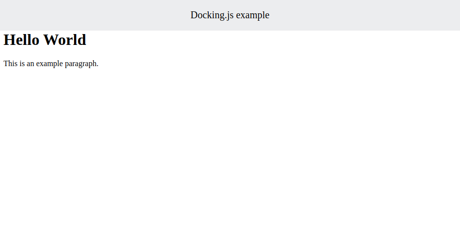
Well, there are many ways in which we could do this, but the first thing that comes to my mind is to wrap our text content within a container and set its margin-top to equal the height of our header.
So, let’s start by creating a new component. I’ll call it Content and thus place it in a content.ts file in the components folder.
import { mt } from "@isotope/prototope";
import { ComponentFunction } from "@isotope/docking/lib/declarations";

const component: ComponentFunction = (page, content, parse) => (parent) => {
  return parent.div([mt(16), parse(content)]);
};
const type = "static";

export { component, type };
Here, we make use of the arguments that Docking gives us. These are:
page- a string corresponding to the name or “slug” of the page the component is used in (not required in our case)content- a string corresponding to the content that’s passed to the component.parse- an Isotope directive that can parse the provided content as Markdown and use it as the component’s children.
So, what we essentially do here is creating a container with margin-top Prototope util applied, that’s meant to hold the parsed Markdown content. Keep in mind that both content and parse arguments are available only on the server-side to "static" and partially "universal" components.
Now, in our Markdown file, we can use our new component like this:
{{ Header }}{{ Header }}

{{ Content }}

## Hello World

This is an example paragraph.

{{ Content }}
Everything that we pass between the two tags will be available to the component through the content argument. It’s important to understand that you don’t have to use only Markdown here. You can pass any kind of stringifiable data e.g. JSON object, to later use it to configure the component.
Let’s check our website again.

Everything works as intended - nice!
Further configuration
With components, we’ve basically covered most of Docking’s functionality. Because of their versatile nature, components can be used in many different ways. But still, we haven’t discovered their true potential.
Template modification
Let’s get back to our Header component. It’s pretty good as it is, but it currently works only for the index page. That’s not the way headers usually work. We don’t want to have to supply our component to each new page we create. Thus, we need to move it to our template.html file.
<!DOCTYPE html>
<html lang="en">
  <head>
    <meta charset="utf-8" />
    <title>Docking.js example</title>
    <meta name="viewport" content="width=device-width, initial-scale=1.0" />
  </head>
  <body>
    {{ Header }}{{ Header }}
  </body>
</html>
Now, the content of our page will still be appended after the Header component, but the component itself will be applied to all pages.
Sadly, because both template.html and the config file are loaded only once, to see the changes, we’ll have to restart our development server.
But, before we do that, there’s still one more problem we’d like to solve. You can notice that our template has its <title> tag’s value hard-coded. It’s not an issue for us right now, but in the future we’ll most likely want our pages to have unique titles for better SEO and user experience.
So, how to solve that? Well, of course - with components!
import { ComponentFunction } from "@isotope/docking/lib/declarations";

const component: ComponentFunction = (page) => (parent) => {
  return parent.child("title", `Docking.js example - ${page}`);
};
const type = "static";

export { component, type };
Above you can see my new Title component that uses the page argument provided by Docking to create a dedicated <title> tag. And, because Isotope doesn’t provide shortcut method for <title> like it does for e.g. <div>, we have to use the child() method with the proper tag name instead.
Now, we replace the <title> tag in our template.html with the {{ Title }}{{ Title }} component and restart our server.
More pages
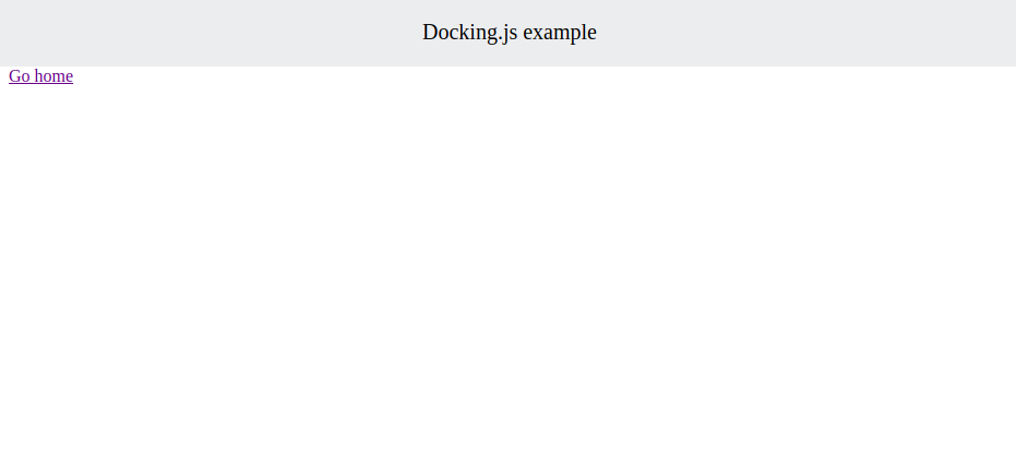
When you view our website you should see that the title is now “Docking.js example - index”. That means that our Title component is working. However, to truly test it, we’ll have to have more than one page. And so, let’s create a new one in the test.md file.
{{ Content }}

[Go home](index.md)

{{ Content }}
You can also put a “Go to test” link in your index.md file.

Now you can verify that the routing works, that our pages’ titles are appropriate and that the Header component appears in both pages.
Config file
With all these changes, I hope you now see how quickly you can make a very functional website with Docking. But we still haven’t touched on the config file much.
So, let’s return to our docking.json and add a new field - say "title".
{
  "title": "Docking.js example"
}
Previously I’ve used “Docking.js example” everywhere. It’s not a good practice to have a repetitive values hard-coded all over your code. So, we can fix that by placing it right inside our config file for later reference. Remember that you have to restart your dev server for the config file to be reloaded.
To show you how you can reference your config properties anywhere in Docking, i.e. template.html, Markdown files, and components, I’ll use our Title component.
import { ComponentFunction } from "@isotope/docking/lib/declarations";

const component: ComponentFunction = (page) => (parent) => {
  return parent.child("title", `config:title - ${page}`);
};
const type = "static";

export { component, type };
As you can see, in the place of our previously hard-coded “Docking.js example”, I now placed the "config:title" string. Docking processes all config: prefixes and replaces them with the correct config value all over your codebase. What follows the prefix is a path to the specific property - in our case “flat” title, but it can also be nested through the use of dots (.) for a complex path (e.g. website.author.name). It’s also worth noting that although these can only have a form of a string when used in your components, you can still use JSON.parse() to get an actual object from the config reference.
Now, check your website if everything works as expected. You can also try replacing all the other hard-coded values with config references on your own.
Building
When you decide that your website is finally ready, just run npm run build and have all the files ready for you in the dist folder.
Summary
If you got through the whole article - congratulations! You now have a pretty good understanding of how Docking.js works! There are still some more advanced aspects like static assets management, remote resources, and dynamic components that we haven’t discussed in this blog post, but I’d say you know more than enough to create your first Docking.js-based website. If you’re interested in the topic, definitely check out the repo for this tutorial as well as the official docs and let me know in the comments if you have any questions or whether you want me to cover Docking.js, together with Isotope and Prototope more in-depth in the future articles.
Docking.js, as well as the entire Isotope ecosystem, although pretty stable, is still in active development. If you want to support the project, consider leaving a star under its GitHub repo, opening an Issue for a new feature or fix, or maybe even contributing some code of your own. Any form of support is appreciated!
For more up-to-date content about Isotope ecosystem and web development as a whole, consider following me on Twitter, Facebook, or through my newsletter below. Thanks for reading this piece and happy coding!
If you need
Custom Web App
I can help you get your next project, from idea to reality.